
San Francisco Department of Public Health

User-centered design, content-driven
Designing a greenfield project for rebuilding trust: The San Francisco Department of Public Health wanted to include an Air Quality and Heat informational site for users to be able to access timely and accurate information in moments of climate emergency.
My role
UX research, UX design, UX writing, content strategy
Methods
Competitive and comparative analysis, contextual inquiry, wireframing, rapid prototyping, user testing,
Tools
Sketch, Invision, Illustrator.
The solution
An information-driven design focused on optimal display of content of two fundamental states: preventative (before an emergency) and emergency (during event), for two specific fields: air quality, and heat.
The problem
After the wildfires on 2017 that affected Northern California and sent San Francisco’s air quality to an emergency state, the San Francisco Department of Public Health had to deal with an unprecedented crisis. To avoid massive panic and inform the city, SFDPH decided to create a site within their massive system of public services to respond to the next air quality and heat emergencies.
Client-specific constraints
-
Two versions of site: one for quick implementation, on their .org old website; and one to fit their transition to the unified .gov website after.
-
Outdated technology on current site: Rigid developmental restrictions for the design to be implementable.
-
Low maintenance: No personnel to keep updating content.
-
Broad spectrum of audience: From techies to unsheltered users.
My team
I worked alongside another designer who focused on contextual inquiry, information architecture, and the design/prototype of the sf.gov site.
Tailored research
How are other cities showcasing and dealing with this kind of problems? What about other countries? What are their prioritative features? How are they translating those priorities to their designs?
Designed to understand public citizenship, my research was shaped by the fact that competitors are not competitors per se—since San Francisco Department of Public Health principle is to offer access to all people—but sources of informative inspiration for an effective design.
I conducted an extensive competitive and comparative research on 15+ websites (government-run or affiliated), 6 non-profit organizations, 6 apps, and 1 sms emergency service.
Insights

Air Quality | competitive
-
Users are coming to these sites/apps for clear, direct information: The majority of the sources evaluated show that the two most prioritized features were “real-time air quality forecast (map)” and the showcase of “Air quality/pollutants levels” alongside a method for the user to understand/read those measurements.
-
In moments of emergency and emergency preparation users tend to look for quicker ways to find information rather than to think about possible patterns. This was visible in the fact that the feature "FAQ" was only present in 2 of the surveyed websites.
-
Promoting impact: 32.5 % of our “competitors” utilize Air Quality’s informative side to offer the user an opportunity to further the experience through the showcase of “pollutant reduction” campaigns.
-
The topic of Air quality is broad and often overflows to other topics such as Pollution or even Heat. The majority of the researched sites commonly use the feature of “additional information/resources” to point the user towards those adjacent topics.
-
Direct actions like “donating” are not encouraged in our "competitors" websites or apps. Only few of the non-profits use this feature.
-
Although some of the sites did include preventative information in case of an emergency, none of them offer a downloadable emergency guide that can be accessed offline.
Insights
Insights
Heat | competitive

-
“Daily forecast” and “News” were the two most common features. Note, then, how the importance of these features relies on values like agility and immediacy.
-
Exactly like in my Air Quality competitive research analysis, I found that "competitors" generally do not include “FAQs” as a feature. This coincidence reinforces the idea of straightness in information that users are looking for.
-
Blurred states: In more than 6 surveyed sites, "preventative" information gets mixed up with "emergency" information, creating confusing, inefficient content as a result.
-
In 80% of the sites/apps, the feature “Additional resources” is used to link up more information on topics and issues surrounding Heat: illnesses, natural disasters, air quality, etc.
Research Synthesis
Combining the two methods of research (contextual inquiry, and competitive and comparative analysis), we, as a team, ended up observing a constant theme: Trust.
Through my comparative and competitive analysis I realized how important was to offer timely, reliable information—all about trustworthiness.
Through my partner's contextual inquiry research, she concluded that one of our most critical challenges was to recover the users trust on the government—after the 2017 wildfires, and because it was a crisis without a precedent, users felt they were left without clear instructions on how to handle an air quality emergency.

Translating our research into design
To tackle the challenge of regaining, and preserving, our users trust, we designed with the outcome of users having reliable information in moments of crisis in mind. To accomplish that we used two key states:
Before an emergency: Preparedness as a principle for safety.
During an emergency: Users will be coming to the site when an air quality or heat emergency is happening.
MVP

Wireframing | Testing

High-fi designs | prototype testing

Content strategy
The problem I was looking forward to solve through content was to eliminating the friction between what our client wanted, and what the users wanted from our client. The friction is exemplified in the lack of clarity on what type of services users should expect from our client.
And lack of clarity translates into distrust, and cynicism.
Client: "People really want to be safe, and that means they want stuff to be safe. In an air quality emergency people are asking us to provide N95 masks, but we want them to know that N95 masks are not the solution."
User: "I don't trust anything coming from the government. When that [wildfires] happened, they didn't even give masks."
If N95 masks are not perfect solvers, users need to have that information. How? I informed the content strategy of this project having in mind two fundamental texts: Jakob Nielsen's How Users Read on the Web (subheadings, bulleted lists, etc.) And the research by Ed Galea on the topic of human behavior during emergencies (Behavior, Security, and Culture) to understand what roles risk, authority figures, and interaction play in the mindset of users in the moment of an emergency event.
Usability testing
We tested our final prototype with 4 new users. The tasks were to find "preventative information for air quality events," "emergency measures for heat emergencies", and to download a "guide to heat emergencies." Thanks to all the previous testing and iterations, all of the tasks were accomplished successfully.
Final insights
Kill your assumptions (once again): Although during states of emergency people panic, that doesn’t mean that people act irrationally. In fact, based on this project’s contextual inquiry and academic research, I learned that people behave in supportive ways, tending to help each other.
Making ‘regaining trust’ explicit: Under these project’s constraints regaining trust became a tangible principle through content (accurate information) and design (scannable).
The future in mind: Designing a simple structure that could be adaptable for future needs. All that our client has to do is to add one more block.
Designing from and with empathy:

It’s getting hard to breathe in San Francisco today…
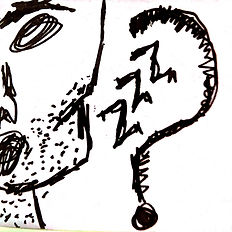
Mike tries to go
back to sleep,
but he cannot rest.

Although Mike is a tough guy, he feels his eyes are burning and pressure in his chest.
He wonders
what’s going on.

So when he sees someone walking by he stops them and asks them why there’s so much smoke today.

But this passerby looks down on Mike and walks faster away.
Mike feels angry: his breathing is getting worse and he feels invisible.

He resorts to his most precious resource, a resource only for emergencies, something that he trusts the most: his phone.

The connection he
has is weak.

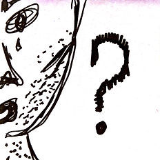
He opens a browser and he types: what’s going on with the air in San Francisco today?

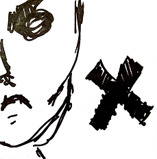
Olivia is worried. She smells smoke, and when she looks outside her window, she sees cars covered in ashes.

She knows something
Is wrong.

She texts her husband because she is alone with the kids.

But her husband is in a business trip. He texts her back: he is busy.

Olivia feels overwhelmed thinking about her daughter’s asthma.

She quickly searches for: Is air safe right now in SF?
Mike and Olivia have never thought of each other’s existences, and perhaps might never meet, but right now they encounter themselves in the same situation, facing the same uncertainty in the city they both share: San Francisco.
The city one way or another they are fond of.