
Conversational design, User Experience writing
now is born from the challenge of designing a solution that aligns social and corporate responsibility to solidify customer relationships and leveraging brand.
Why?
Although our phones have become undoubtedly a vital tool to survive modern life, it is also true that our relationship to them is continually challenged by the amount of time we spend looking at these screens. In a world in which we constantly battle dependency on external devices, we are often striving for a way to be mindful of the balance between our online and offline lives.
The solution
Design a mobile app that encourages smartphone users to take on/engage with desirable offline activities.

Red Bull
Why Red Bull?
This high fast-paced, energetic brand is a contemporary synonym of adventurous and action-filled living often associated with offline life.
Through a brand study, it became quite visible that ‘sponsorships’ are a prominent strategy that Red Bull uses in marketing, in addition to an extraordinary prioritization of content over product. These two characteristics shape how Now matches the brand with an angular approach to advertising: it is not about pushing Red Bull, but about relating a “way of living” to their product.
Discovery | Guerrilla Research
Through qualitative research (in-depth interviews to 6 users with an average screen time of 4 hours daily) I wanted to find out about two different aspects: first, online: what users do on their phones, what routines do they have, what sort of online activities they engage in. And second, offline life: what users do with their time outside the digital world.
“I want to be less of a consumer and more of a creator.”
User interviewed
Insights
-
Closer than we think: 83% of the interviewees feel like they are ‘closer’ to their loved ones thanks to communication apps
-
Tons of guilt: 100% of the interviewees consider that even “little time” on their phones is “too much.”
-
No-phone life means ‘healthy’ life: respondents often made strong associations between offline activities and wellness in general.
-
Fun stuff: when do interviewees use their phones the most? When they are looking to take their minds out of something: boring commuting, waiting in lines, relaxing before falling asleep.
-
And speaking of sleep: Despite the fact that the interviewees knew about the effect of phone screens on sleeping, 66% of them still use their phones in bed.
Proposed sponsor
My role
UX design
UX writing
Methods
Guerrilla research, wireframing, rapid prototyping, user testing.
Tools
Figma, Illustrator.
One of the most illuminating findings in the stage of competitive analysis was to find that our competitors’ apps are focusing heavily on “productivity,” both as a concept and a narrative: tasks, organizing, time-tracking, activity reports, view most productive days, etc.
And while apps like Space attempt to change their tone to a more inspirational and encouraging one with features like “daily inspirational quote,” still its main features are focused on intensive control (on-screen timer) and tracking (number of screen unlocks).

How to compete against phones? How to make people want to stay away from their phones?
Ideation
I approached this stage with a question:
What factors came up to the surface after interviewing users and doing the competitive analysis?
Three user concerns:
-
Never enough: They feel they are not doing enough to stay away from their phones.
-
All work and no play: Apps currently in the market are willingly neglecting a vital part of human living: leisure.
-
Sanction: now's competitor’s often lead with a narrative of penalization and restraint, two things that lack appeal and persuasion, especially when thinking about my main goal: to seduce users to stay away from their phones.
MVP

.jpg)

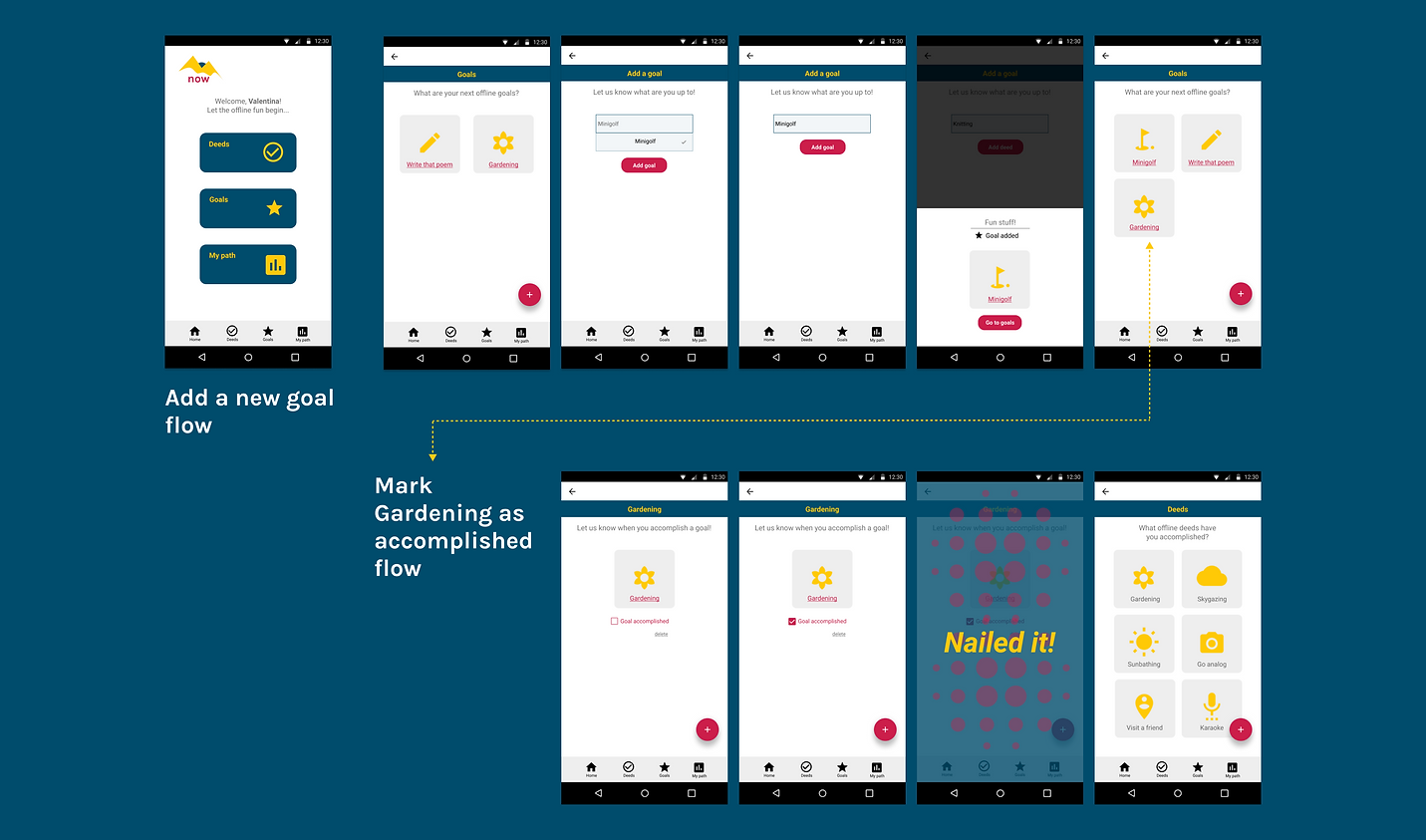
Wireframes | Usability testing
For the low-fi prototype testing, I observed 6 users interact with my design.


High-fi designs | prototype testing

Conversational design strategy
Consistent and affirmative, generative and informative.
As a writer designer, my approach to UX writing is to always remember that a human is on the other side of the product.
Tone-wise my goal is to maintain a consistent resonance throughout the app’s experience: now is not about the sanction or prescription of online behaviors, but rather about the positive reinforcement of offline practices and habits.

-
A conversational tone that appeals to users sociality. Why? Master researcher and designer, Erika Hall explained it altogether: “the simplest system that works for people: the conversation.” Which means, language stretching itself to meet the user (not the other way around).
-
Persuasion vs. Authority

Usability testing | insights
What went well:
-
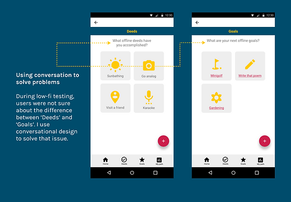
Flows were achieved without friction by the majority of the users. During the prototype testing, I asked the users to talk through the process to know the rationale behind their actions, all of them referred to the messages on top of the screen as "instructions" that helped them engage with the features.
-
One part I was interested in testing was wording and tone. When asked about the concepts as well as the voice used in the writing of the app, users noticed the contrast between the narrative used in apps to "control on-screen time" and now app. They referred to it as "happy" and " interactive".
What needs work:
-
After the splash screen, 5 of the 6 users asked questions as to what to do first in the app. To avoid confusion or disorientation, it is necessary to create an onboarding flow to introduce users to the app seamlessly.
-
Interestingly, 2 of the 6 users tested expressed how useful the options displayed in the dropdown menus for deeds and goals were. But they were also wondering what if they didn't have a particular activity in mind; they wondered how the app would engage with uncertainty.
Iteration
"Sometimes I have free time, but no idea of what to do that doesn't involve my phone."
User feedback
During usability testing, I asked users to try to articulate what they were thinking while interacting with the prototype.
What caught my attention was when the ‘add a new deed’ dropdown menu appeared, two of the users say they “liked it”, and they liked it, as one of them put it, “because I haven’t even think about doing these things, and now I sort of wanna smile at a dog.”
This iteration aims to gamify the experience to persuade users to come back to the app regularly while at the same time encouraging offline activities.

Next steps
In the same spirit: add a feature to award users. Introduce “shelf of achievements.”
Test it. Test it, incessantly.

In a world full of screens, it gets difficult to see
the big picture.

That can leave us confused, and sometimes even perplexed.

What about human-to-human interactions? or reading that book? What do you see when you look through that window?

We get it. We love our phones. They get us to the thing, but they are not the thing.

In that state of uncertainty, we often ask ourselves: what is the important thing to do?

What goes first? What second? Are my priorities really my priorities?

So, for us, this thing called life is about trading out screens.
